Product Details
key features
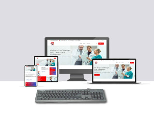
Responsive web design (RWD) is a web design approach that makes websites render well on a variety of devices and window or screen sizes from minimum to maximum display size to ensure usability and satisfaction. This means that your website will look good and be easy to use on all devices, from desktop computers to laptops to tablets to smartphones.

Responsive web design (RWD) is a web design approach that makes websites render well on a variety of devices and window or screen sizes from minimum to maximum display size to ensure usability and satisfaction. This means that your website will look good and be easy to use on all devices, from desktop computers to laptops to tablets to smartphones.